Earlier this year, we were asked by visual artist Anna Schuleit Haber to take part in her Fitchburg Alphabet project. For 26 days, one letter designed by a different designer is being shown on the front page of Fitchburg’s daily newspaper each day.

Earlier this year, we were asked by visual artist Anna Schuleit Haber to take part in her Fitchburg Alphabet project. For 26 days, one letter designed by a different designer is being shown on the front page of Fitchburg’s daily newspaper each day.
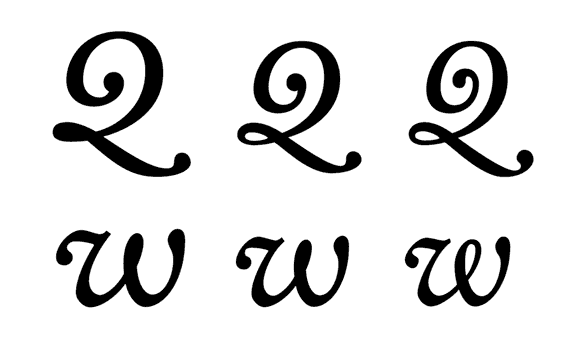
Last week we started the pre-order for our book “Size-specific adjustments to type designs”. Here, we would like to share a part of the content to give you a better idea of the book. This sample is “Suppression and emphasis of features”, a section from Chapter 6: Design advice (full table of contents here). Keep in mind that this is just one of several techniques to optimize a type design for different sizes.