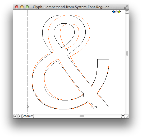
As pointed out by Stepen Coles yesterday, Ars Technica wrote about a modified version of Lucida Grande, “optimized for Retina displays”, in their review of the new Mac OS 10.9 “Mavericks”. So, what exactly could make a font “optimized for Retina” and which modifications did Apple make?