→ Update: You can now order the book.
With a little delay, we are coming close to finalizing this project. The book has been proof-read by Sally Kerrigan, and the foreword is being written by Christian Schwartz.
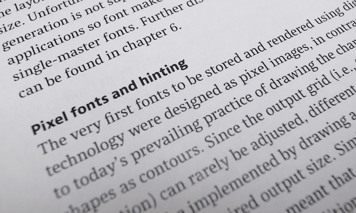
The original version of this paper was written as part of Tim Ahrens’ MA in Typeface Design at the University of Reading in 2007. Tim first became engaged in the issue of optical sizes while he worked on the digitization and redesign of the Leipziger Antiqua (published as JAF Lapture in 2004). Through the project, he realised that although size-specific adjustments were commonly practiced for 500 years of metal type printing, not much documentation was available on the subject. This lead him to research and write about it himself, in the hope that the outcome would become a useful source for practitioners who wish to create fonts with size specific styles. The book looks into type history and perception psychology, and analyses designs by old masters as well as numerous contemporary designers.
Here are the differences from the previous edition:
• Shoko Mugikura joined Tim Ahrens in writing this edition. As a result of our discussions, we gained some new insight and observed techniques that do not match the conventions previously thought to be obvious.
• Format: 200 × 300 mm (previously 185 × 263 mm)
• Printing: offset, 2-colour (previously black and white print on demand)
• Page number: 192 pages (previously 174 pages)
• New structure: while the first edition retained the academic style of the original paper, in the new edition, we worked to improve the structure so the readers can navigate through the information more easily.
• New texts and images: we added new texts where further clarification seemed helpful, as well as some more imagery to facilitate our discussion. We extended particularly the chapters “Reasons for size-specific designs”, “History”, and – most importantly – “Design advice”.
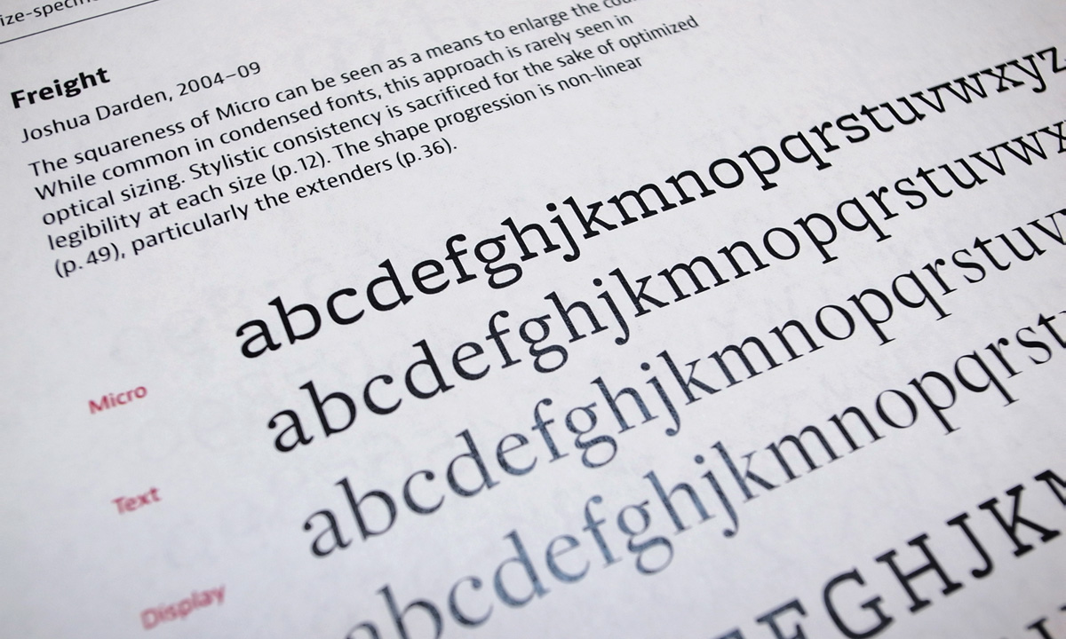
• Type specimen section: over 50 new designs are included, and we added our observations and comments on the individual typefaces, which we believe provides the reader with useful insights into the subject.
• Typeface: the book is typeset in Bernini Sans and Bernini Serif, which will itself come with optical sizes!
During the process of updating the specimen section, we happily learned from some designers that their typefaces were produced with the guidance of the first edition. We very much hope that this edition will continue to raise awareness of the issues at hand.
While the subject matter is very specialized, we hope that through the discussion of size-specific issues, we reveal insight into type design, typography, and reading in general.
We will start taking pre-orders of the book within the next weeks – so stay tuned!


Is your book still for sale? Thanks! José
Yes! Here is the link to the order site:
https://justanotherfoundry.com/size-specific-adjustments-to-type-designs
Okay. I bought it. Thank you.