Last week we started the pre-order for our book “Size-specific adjustments to type designs”. Here, we would like to share a part of the content to give you a better idea of the book. This post is based on a section taken from Chapter 5: Perception psychology and reading research (full table of contents here).
Reading research
Although research has been conducted on reading for over a century, not all aspects have yet been explained. Reading research has not come up with specific techniques or advice on how to design typefaces that are easy and pleasant to read. However, understanding why and specifically in which ways letters are perceived differently depending on their scale can help us understand in which ways optical sizes need to differ. The scientific notions described here are to be seen as a medium in which to think of the various kinds of optical compensations, rather than as statements that directly imply instructions by themselves.
Spatial frequencies
If we consider that the acuity is limited even in the centre of the visual field, we can make more specific statements in terms of spatial frequency. Similar to the frequency of radio or sound waves, spatial frequencies describe a two-dimensional image in terms of the rate at which it alternates between two values – in the case of type, black and white. Each alteration from white to black to white is referred to as a cycle. While sound is one-dimensional and its frequency refers to a unit of time, spatial frequencies typically describe two-dimensional images and give the cycles per unit of length. However, when the resolving power of the human eye is discussed and the reading distance is not known, the frequency is more generally given in terms of visual angle. The highest spatial frequency we can perceive is 60 cycles per degree (cpd) (Bigelow et al. 1983) and any information beyond this limit is filtered out. This low-pass filter is in its effect very similar to blurring as it occurs when a camera is out of focus. The reason for this limitation of acuity is that the image projected onto the retina is sampled by discrete cells, much like in a digital camera, and therefore has a limited optical resolution. Given a reading distance of 40 cm, any two objects to be discerned as separate by the eye must be at least 0.1 mm apart (Karow 1994). The typical height of the counter of the letter e at 5 pt just fulfills this requirement (ibid.).
Letters are made of frequencies
The concept of spatial frequency not only serves to express the limitations of what we can perceive, but can also be used to discuss further size-related phenomena. Richard Rubinstein (1988) calls frequency analysis “the basic engineering tool for attacking the problem of letterform quality”. The image of a letter contains various frequencies: the main letter features are normally between 4 and 8 cpd at average text size and distance; the corners, sharp edges, and smaller elements such as serifs are represented by higher spatial frequencies and therefore get filtered out first. Here, “first” is used to mean “as the size gets smaller” and at the same time “with increasing distance from the centre of the visual field”. For small sizes, it might be an approach to avoid details that require high frequencies – in fact, several of the modifications described in chapter 6 can be interpreted in this way.
Analogy between spatial and sound frequencies
Remarkably, not only are high frequencies filtered away with decreasing acuity, but as the size increases, low frequencies – representing the main features of a character – are weakened. Applied to typefaces, this means that certain features transported by low frequencies, such as weight distribution and overall proportions, that are dominant at small sizes are less noticeable when the letters are viewed at larger sizes.


Squeezing, stretching, scaling
There is another interesting analogy between spatial and sound frequencies: If something is scaled down or sped up then its frequencies shift upwards, causing some frequencies which were perceptible before to become invisible or inaudible. More importantly, the process has a significant effect on the appearance. Type scaled down is like a record played at too high a speed: unnatural and squeezed, a phenomenon which in sound processing is often referred to as Mickey Mouse effect or munchkinization.


On the other hand, the scaling up of a font resembles the pitching down of a record, which makes it sound inert and dull, and without the nuanced intonation and rhythm as when the words are actually spoken slowly.


In this sense, designing optical sizes means drawing shapes that speak slowly but elegantly, or quickly but clearly. In sound processing, intelligent time stretch tools allow to speed sound up or down while avoiding the undesired changes in frequencies, by cutting away or duplicating whole waves. Although an identical approach would not be possible in type – for example, adding a fourth leg to an m is not the right way to make it larger – it is conceivable that the task of correcting frequency shifts could be performed by an automatic procedure some day.
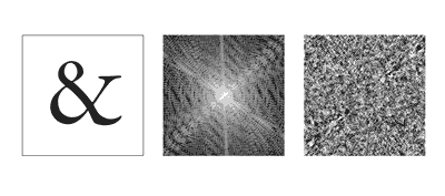
Frequency analysis
The frequency components of letters or words can be analysed and manipulated with the help of Fourier transform, which interprets an image or sound as an overlay of waves at different frequencies. This transformation returns the amplitude – the height of the wave – of each frequency component, which shows how dominant it is, and also its phase, which is determined by the location of the features it describes (fig. 18). When applied to an image, the amplitude spectrum shows only the orientation of the edges in the original image while the phase also contains the information about their position. Although the phase spectrum in the example does not look very distinctive, it is much more relevant for the identification of letters than that of the amplitude, which is “relatively unimportant in distinguishing characters from one another” (Morris 1988). For example, the m and the n have almost identical amplitude spectra (ibid.).

18. Fourier transform of an ampersand from Arno Pro Subhead
Together, amplitude and phase spectra contain exactly the same information as the original image, so the Fourier transform can also convert the data back into letter shapes. This allows us to emphasize or filter away parts of the spectrum or even produce frequency shifts. Unfortunately, what sounds like the perfect tool for automatic size-specific compensations inevitably creates a grayscale image as an output, and therefore cannot be applied directly to generate black and white letter shapes. Furthermore, Najib Majaj et al. (2002) suggest, “the Fourier power spectrum is a poor model for the pattern of activity in our visual channels”.
Reference
Bigelow, Charles & Donald Day (1983), “Digital typography”, Scientific American, August 1983, pp. 94–105
Karow, Peter (1994), Font technology, Springer, 1994
Rubinstein, Richard (1988), Digital typography – An introduction to type and composition for computer system design, Reading, MA: Addison-Wesley, 1988
Morris, Robert A. (1988), “Image processing aspects of type”, EP88 conference on electronic publishing, Nice: Cambridge University Press, 1988
Majaj, Najib, D. Pelli, P. Kurshan & M. Palomares (2002), “The role of spatial frequency channels in letter identification”, Vision Research, 42, 2002, pp. 1165–1184