While everyone else seemed to be heading to the ATypI conference in Amsterdam yesterday, JAF spent a day in Hamburg.

We have been digitizing a very peculiar typeface called “Johannes-Type”. We first came accross this typeface in the specimen book 50 der schönsten Schriften aus 100 Jahren Schaffen 1833–1933 from the Genzsch & Heyse type foundry in Hamburg.
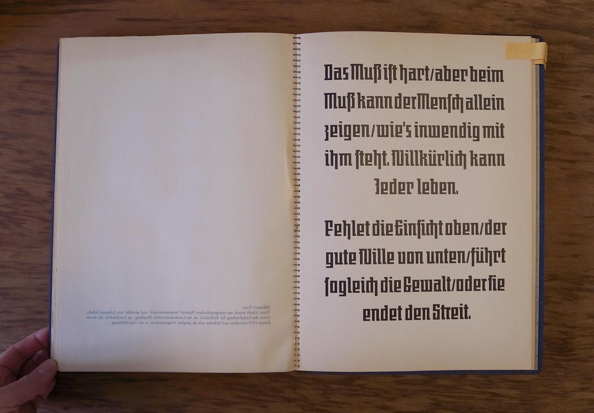
This seemingly “Techno meets Blackletter” typeface caught our eyes instantly – it is hard to believe that the design dates back to the 1930s. As soon as we discovered that a digital version is not yet available, we decided to give it a go ourselves.
While the design itself is simple and easy to digitize, the problem was that not much information is available on this typeface. We did not have anything but the above specimen – not nearly all the characters necessary to make a font. For a long time our research was not fruitful, and we nearly believed the theory that only prototypes were made for the catalogue and the typeface was not commercially produced.
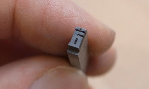
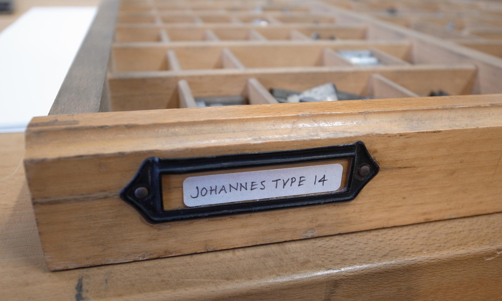
However, recently we learned that 14pt and 20 pt metal types of this typeface are kept at the Typography Workshop at Hochschule für bildende Künste in Hamburg. So we took a train to Hamburg and finally met the original typeface!
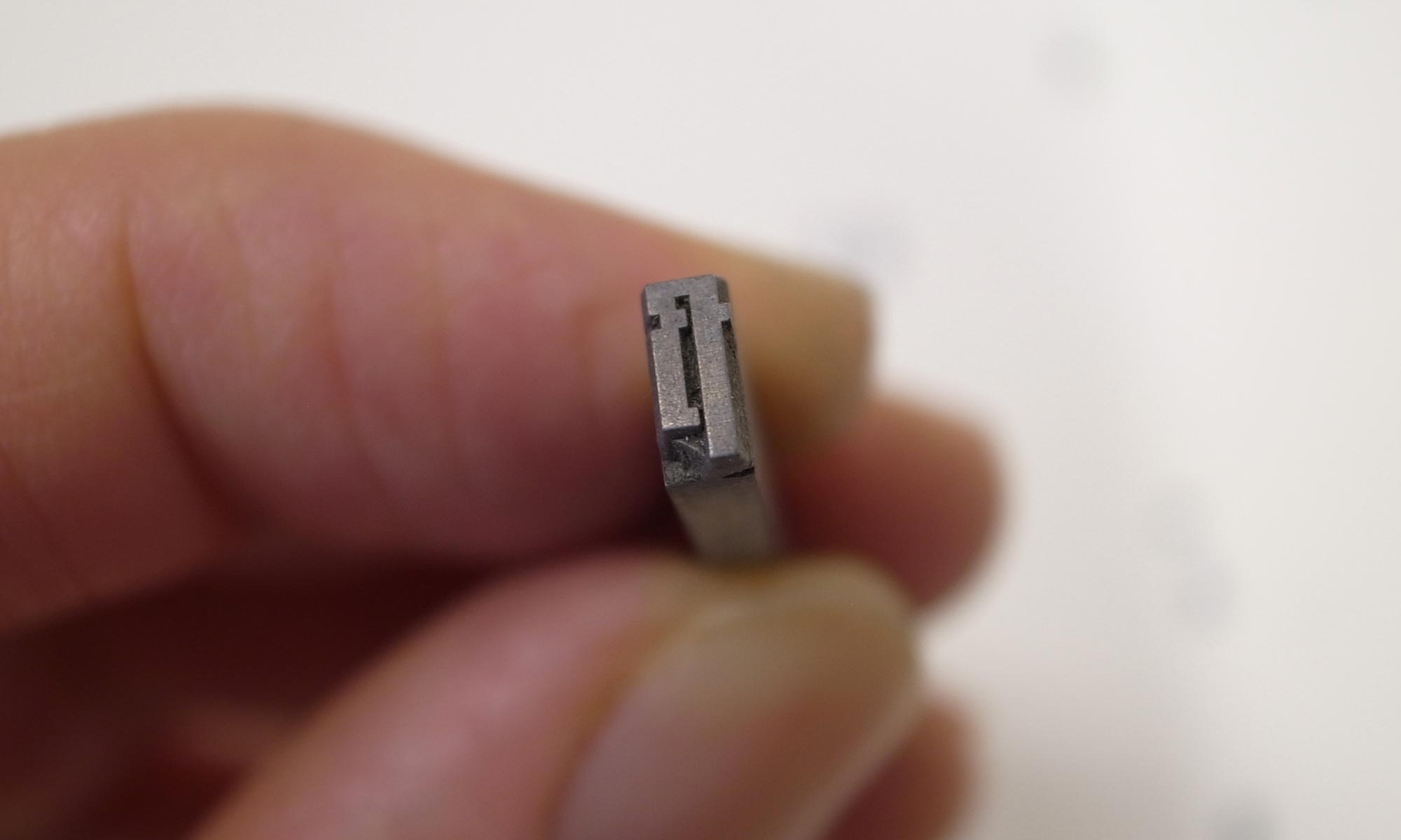
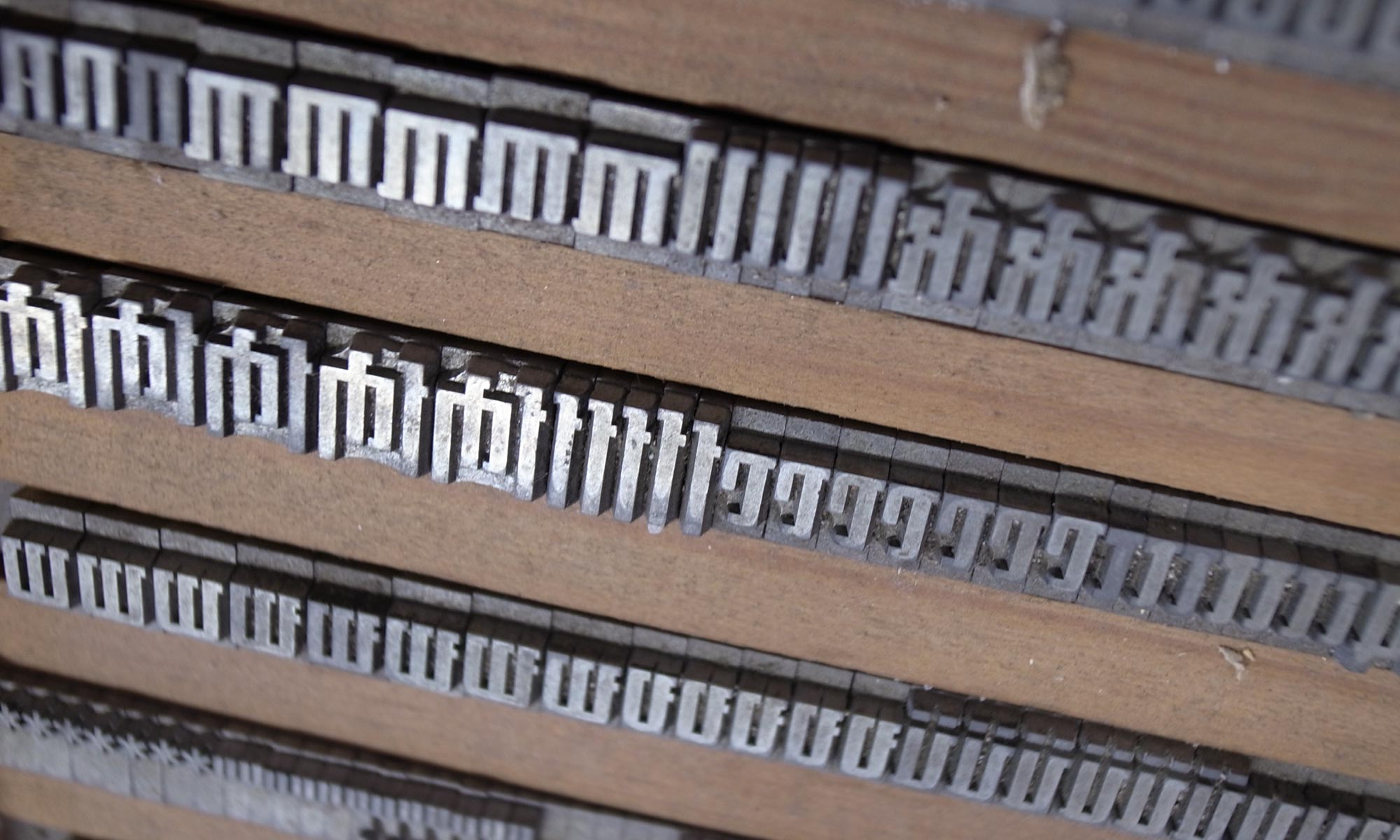
We are working on a digital version under the name JAF Johannes – it is not a typeface for everything, but the strong visual appearance can certainly create provocative typography.
Many thanks to HFBK’s Claire Gauthier and Hannah Rath for their generous help. It was fun climbing around in the dusty attic in search of old types.
Do you have any further details on JAF Johannes typeface and its development.