Last Saturday we gave a presentation at the 6th typography meeting in Aveiro, Portugal. The theme of this year’s conference was “perception”.
Our talk was titled “Tricked!” – we attempted to explain how our eyes and brains play a lot of tricks as we read, and manipulate the visual information even before it reaches our conscious thinking. We talked about cultural aspects (how our background biases what we see), as well as perception psychology.
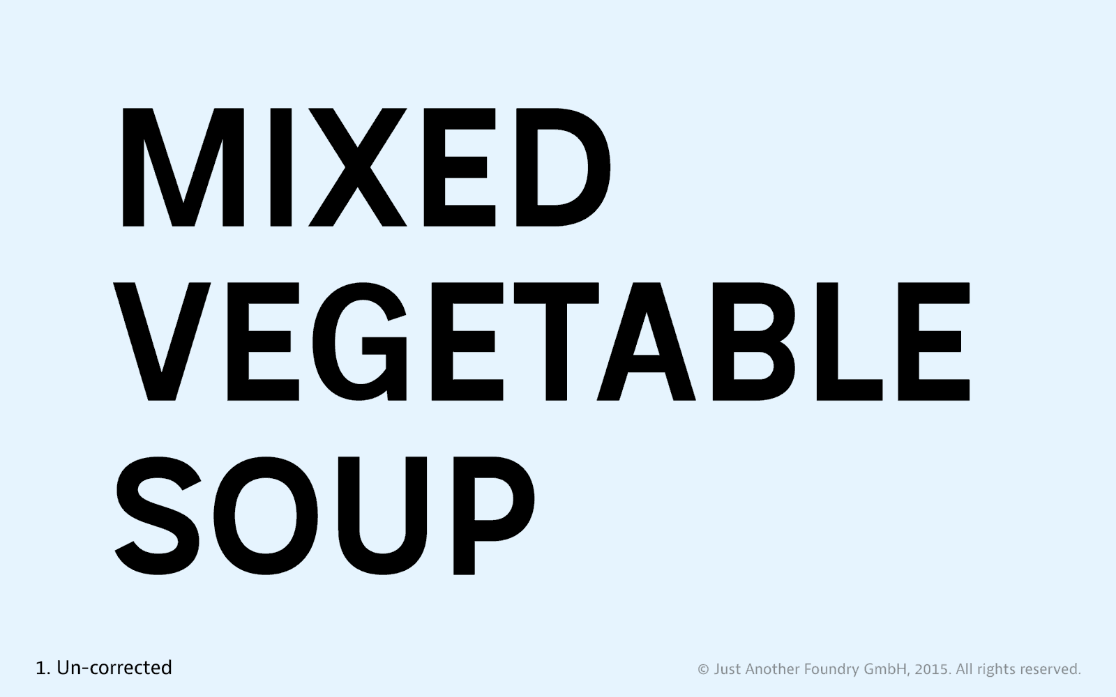
One part of the presentation demonstrated the necessary visual corrections of letters step by step so they look as intended. We think it could serve as an overview of the “anti-tricks” that can be found in every font, so we created an animated gif and a PDF for download.