→ Update: You can now order the book.

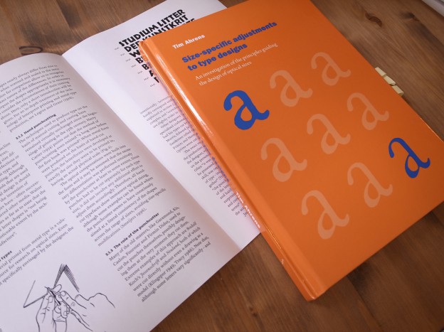
We are happy to announce that we are in the process of updating and re-publishing Tim’s book on optical sizes, currently titled “Size-specific adjustments to type designs”. We have been constantly asked about the availability of the book, but the book has been extremely difficult to obtain. Furthermore, it was overpriced since the book was produced “print-on-demand”. Finally, we got out of the contract, and we are updating the book with new materials and a re-designed layout.
We would like to include the fonts with optical sizes which were published after 2007, the year the first edition was published.
Here is our list of digital fonts. Designs which are marked with * will be considered to be included in the new edition; those which are not marked with * were included in the first edition already. Some foundries did not respond to the request back then, therefore not all the fonts with optical sizes could be included.
Please help us complete the list of newly designed optically sized fonts!
[Update: Thanks to your comments and emails, we extended the list. The new entries are in brackets.]
Abril *
FF Acanthus *
Acta Display *
[Aeris]
[Alida]
[Anselm]
[Apud]
Arlt *
Arnhem
Arno
[Axiom]
Baskerville (Storm) *
Benton Modern *
Beorcana
Berling Nova *
Bodoni (ITC)
Bookman *
Borges *
Brandon Grotesque/Text *
Brioni *
Brioso
Brunel
Bulmer
Californian FB *
LTC Californian *
[Capitolium 2]
[Carmen]
FF Celeste *
Chaparral
[Chift]
[Chronicle]
FF Clifford
[Consul]
Coranto 2 *
Cronos
Cycles
[De Archie]
[Delvard]
[ARS Descendiaan]
[HTF Didot]
Domaine *
Edita *
Eldorado (Font Bureau)
[Electra]
Escrow *
Fakir
Farnham
[Fayon]
Fedra
[Feijoa]
Fleischmann (DTL)
Founders Grotesk *
Freight *
[Freya]
Garamond FB *
Garamond Premier
[Genath]
[Geo]
Giorgio
Glosa *
FF Good & Headline *
Greta
[Grumpy]
Guardian Egyptian
[Guardian Sans]
Harriet Series *
[Hercules]
FF Holmen *
[Home]
Houston
Ibis *
[Indigo Antiqua]
FF Info
[Irma]
[ITC New Esprit]
Jannon Storm *
Jenson Adobe
Juliana
FF Karbid *
Kepler
King’s Caslon *
[Klavika]
Lapture
[Lavigne]
Le Monde Livre *
[Leitura]
[Locator]
[Lyon]
[Mafra]
[ARS Maquette]
[Marlene]
Mencken
[Mercury]
Meta
Miller
Minion
Miniscule
[Mommie]
[Narziss]
[Neue Haas Grotesk]
[New Fournier]
Nimrod *
Officina
[Paperback]
[Perfetto]
[Periódico]
[Polo]
Philomela
[Pona]
Poynter *
[Pratt]
Prensa *
Prumo *
PT Sans *
PT Serif *
[Publico]
Pyke *
[ReDisturbed]
[Regal]
[Reina]
FF Reminga *
[Requiem]
[Rialto]
Romain
Rumba *
Sanvito
Satyr & Faunus *
[Schadow Antiqua]
[Scotch Modern]
[Seaside]
[Sirenne]
[Stilson]
[Sybarite]
[Tabac]
Taz *
Tiempos *
[Tramuntana 1]
[Transit **]
Trivia Serif *
[Turnip (Re series)]
Utopia
[Velino]
[Verdigris]
Vesta & Big Vesta *
Vincent
Walbaum Storm *
Walburn *
Whitman
Ysobel *
Zocalo *
A great resource, Tim. Do you have any of ours in there?
HTF Didot
Requiem
Mercury
Chronicle
Hi Jonathan, yes, we are aware of the H&FJ fonts. We have been in touch with your team last week regarding a press licence. It would be great if we could include them in the book.
This is great news! I had always wanted to get a copy of the book, but held out because the price and production quality of the original. Looking forward to the revised edition.
We had no control over the production of the first edition; the new edition will be different!
The book looks terrific. But no Warnock?
ReDisturbed owes a lot to your book
Max is right; Warnock is the one Adobe optical-size family missing. Nice list; looking forward to the book!
Hi Tim!
Aeris
http://www.linotype.com/6466/aeris.html
ITC New Esprit
http://www.linotype.com/6331/itcnewesprit.html
Sabon Next
http://www.linotype.com/en/53159/sabonnext-family.html
Lavigne
http://www.re-type.com/fonts/fonts-lavigne.html
Several typefaces by Hubert Jocham
Alida
http://www.hubertjocham.de/shop/type/serif/AlidaDis/
http://www.hubertjocham.de/shop/type/serif/Alida/
Narziss
http://www.hubertjocham.de/shop/type/display/Narziss/
http://www.hubertjocham.de/shop/type/serif/NarzissText/
Perfetto
http://www.hubertjocham.de/shop/type/serif/PerfettoPro/
Storm Type Foundry
Anselm
http://www.stormtype.com/family-anselm-serif-pro.html
Hercules
http://www.stormtype.com/family-hercules.html
Capitolium 2
http://www.type-together.com/Capitolium%202
Carmen
http://www.typerepublic.com/carmen.html
De Archie
https://www.playtype.com/font/de-archie
https://www.playtype.com/font/de-archie-display
Home
https://www.playtype.com/font/home-display
https://www.playtype.com/font/home-text
Fayon
https://ourtype.com/#/try/pro-fonts/fayon/
https://ourtype.com/#/try/pro-fonts/fayon-grande/
Feijoa
https://klim.co.nz/retail-fonts/feijoa/
Paperback
http://www.houseind.com/fonts/paperback
Grumpy
http://www.myfonts.com/fonts/suomi/grumpy/
Reina
http://www.myfonts.com/fonts/argentina-lian-types/reina/
Indigo Antiqua
http://www.fonts4ever.com/search_result_details.php?f_shops_id=2&selectedFamilyID=18&f_item_name=Indigo%20Antiqua%20Pro%20Display#familyName
http://www.fonts4ever.com/search_result_details.php?f_shops_id=2&selectedFamilyID=19&f_item_name=Indigo%20Antiqua%20Pro%20Text#familyName
Apud, Leitura, Mafra, Velino
http://www.dstype.com/fonts/
Guardian Sans, Lyon, Publico
http://commercialtype.com/
Marlene, Delvard
http://www.typonine.com/
Periódico
http://www.emtype.net/Periodico_Text_Display_01.php
Pona
http://www.myfonts.com/fonts/tipografies/pona/
http://www.myfonts.com/fonts/tipografies/pona-display/
Pratt
http://www.myfonts.com/fonts/shinn/pratt-pro/
Worldwide
http://www.myfonts.com/fonts/shinn/worldwide/
Scotch Modern
http://www.myfonts.com/fonts/shinn/scotch-modern/
Regal
http://www.parachute.gr/typefaces
Sirenne, MVB Verdigris®
http://www.mvbfonts.com/mvb_sirenne
http://www.mvbfonts.com/mvb_verdigris_pro/
Tabac
http://www.myfonts.com/fonts/suitcase/tabac/
Tramuntana 1 Pro
http://www.myfonts.com/fonts/tiponautas/tramuntana-1-pro/
Stilson
http://www.fontbureau.com/fonts/Stilson/
Sybarite
http://www.myfonts.com/fonts/dunwich/sybarite/
Consul
http://www.terminaldesign.com/
Freya
http://www.typogra.fi/
Geo
http://www.110design.ru/customtype.html
This is a great list (also the comments) and I’ll link to this post from my list if I may.
Additions I’d have (ach, take the links from my site if you want, getting too confusing in here)
Irma
Klavika
Locator
Lyon
Neue Haas Grotesk
Publico
Transit (I counted that because Front, Back … are technically not grades, not the same spacing)
Turnip (I counted that because of the RE version, but then one should count the typefaces with REs too) (Is RE a special case? Maybe worth discussing in a paragraph.)
And I had Hoefler Text and Titling but that opens the can of worms with the more independent Titling designs (e.g. Renard too).
Thanks Indra.
Yes, we will re-write the introduction and are intending to mention screen-optimised version of fonts. A book published in 2013 from Tim Ahrens without mentioning type on screen sounds odd indeed.
DF Rialto by Giovanni de Faccio and Lui Karner has three optical styles; Titoli, Roman and Piccolo.
Genath
http://www.optimo.ch/typefaces_Genath.html
New Fournier, which is no longer avaiable, by François Rappo
http://swisstypefaces.com/media/ul/fonts/pdf/swisstypefaces-NewFournierBP.pdf
Electra
http://www.myfonts.com/fonts/adobe/electra/
Mommie
http://www.hubertjocham.de/shop/type/script/Mommie/
Stuart Pro
http://www.myfonts.com/fonts/nonpareille/stuart-pro/
Chift
http://www.myfonts.com/fonts/alexandra-korolkova/chift/
Seaside
http://www.myfonts.com/fonts/andrijtype/seaside/
Thanks a lot for your help – your memory of fonts is simply amazing!
Great news. Where and when will the book be released?
When: aiming for this Autum
Where: from us, self-publishing. Still working out distribution model.
I want one. I want one. Please keep me posted.
Very happy to hear this. Identifont’s long list may have some you missed.
Thanks, Stephen. Yes, we had gone through that list. It’s actually not complete (JAF Lapture is missing although on Identifont, for example), and contains some entries that are not real optical sizes. It was very helpful nevertheless.
Have you considered including screen-geared designs like Font Bureau’s RE series?
Yes, we have included some of them, for example Ibis. They are not designed strictly as optical sizes, rather as screen versions, but maybe that makes them even more interesting as samples to look at. The adjustments are similar to traditional small size versions, of course.
Great to know about this book, Tim.
You could add:
ARS Maquette Pro (Text and Display cuts)
the soon to be released new ARS Descendiaan (Roman and Display cuts)
Cheers,
A
Schadow Antiqua (C.E. Weber) — sold as Schadow by MyFonts. Originaly the light cut was sold as Werk Display cut.
I don’t think Schadow counts in this given frame. Both Schadow Antiqua Werk and Schadow Antiqua Mager were available in a range of sizes, Werk in 5pt to 36.
Wow, now that’s a great news! I’m really looking forward having a copy!
Great ressource, indeed !
I think you should add MS Sitka, too : http://typedrawers.com/discussion/470/new-microsoft-size-specific-design-selection-mechanism
Any update about when will the book be released?
I need my copy ASAP… 🙂
António
I’m eagerly awaiting this book! I’ll happily support a kickstarter to help it along.
Plus 1 on Sitka :), any thoughts on non Latin fonts? I have been wondering if there are any Japanese optically scaled fonts?