Last week we started the pre-order for our book “Size-specific adjustments to type designs”. Here, we would like to share a part of the content to give you a better idea of the book. This sample is “Suppression and emphasis of features”, a section from Chapter 6: Design advice (full table of contents here). Keep in mind that this is just one of several techniques to optimize a type design for different sizes.
Suppression and emphasis of features
If the typeface has small-scale features it is advisable to simplify the shapes in smaller sizes “instead of reducing them mechanically, which would have the same effect as squeezing a complex cathedral to the size of a chapel” (Klingspor 1949, see fig. 41).

41. Comparison of optical sizes in the metal version of Wilhelm-Klingspor-Gotisch. From left to right: 8–10 pt, 12–14 pt, 16 pt, 20–60pt
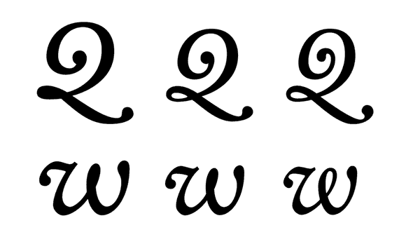
Sometimes this simplification implies not only that details are tweaked, but also that the general structure changes. The Q and the w in Kobayashi’s Clifford* italic are pertinent examples of such a change in design (fig. 42). The designer considers this modification “not only as a limitation to burden the design process, but also as a kind of design characteristic”, as an incentive to add variation beyond the necessary compensation (Kobayashi 2007).

42. From left to right: Six, Nine and Eighteen
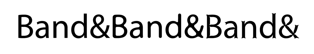
Other examples of “fussier details” (Schwartz 2007) that were removed in the text version can be found in the e M and Z in Schwartz’s Houston* (fig. 43) and the g in his Giorgio* (fig. 44). Similarly, the drop terminals in Alida* are pointed in Display but not in Regular.

43. From left to right: Text, Head and Deck

44. From left to right: Small, Medium, Large and XLarge
As explained above, the limited perception of high frequencies at smaller sizes is similar to purely optical blurring as it occurs in phototypesetting. The anticipation of these effects leads to very similar adjustments for phototypesetting and for small optical sizes. An interesting design in this context is Unger’s Demos (fig. 45). Designed to stand up to the optical degradation in phototypesetting, this typeface has rounded corners already built into the design so the shape passes more easily through the printing process without suffering from unpredictable distortions: “When all vulnerable details are rounded off in advance, letters retain their basic shapes,” Unger (1979) explains. We could take this approach as a model for small size variations of a design.

45. Pre-rounding in Gerard Unger’s Demos
The opposite of the strategy of “pre-degraded” shapes would be: “What is supposed to look like 100 percent has to start off at 120 percent.” This statement, found in an advertisement for Berthold (1980) formulated by Spiekermann, illustrates the principle of pre-compensation. To a certain extent, the deteriorating optical effects can be taken into account and the initial shape can be drawn in such a way that, after the filtering out of high spatial frequencies, the shapes look as intended (fig. 46).

46. Pre-compensation of optical rounding effects in phototypesetting (Frutiger 2004, redrawn)
Today, digital processing of the contours can achieve both rounding and “sharpening” automatically (fig. 47). It is, however, the designer’s responsibility to choose the right extent of the effect and whether it is supposed to be “invisible” or an eye-catching stylistic effect.
47. Automatic processing of letters (left) with the help of Frederik Berlaen’s roundingUFO program. The font used in this demonstration is Myriad.
Dwiggins, who was a type designer and maker of marionettes, also employed the concept of pre-compensation. In order to make the puppets more recognizable from the last row of the audience, he emphasized the features on their faces by making them simpler, coarser, and with more prominent edges and corners. For some of his typefaces, he used the same strategy. “These letters are ‘classical’ anatomy processed à la marionette,” Dwiggins said in 1937 of the system, which he named M-formula (Unger 1981, see fig. 48).

48. Dwiggins’ illustration of the M-formula, and its application to letter shapes. Photo by Rita Dwiggins Hoover.
Although decorative features should generally be removed at smaller sizes, those that are important for the recognition of the letters should be emphasized. “Whatever is there should be fully visible,” Carter (1937) suggests. Furthermore, “the eye reads only the distinguishing features of the letters, and so the distinguishing features should be stressed in proportion to the difficulty of reading” (ibid.). Slimbach (2007) points out that this emphasis is not an exuberant exaggeration like the oversized nose of a comic character. The features, he explains, are only physically given more “presence” (ibid).
* Starred typefaces are featured in the specimens shown in the book.
Reference
H. Berthold AG (1980), “Warum Arbeiten, die auf Berthold-Geräten gesetzt wurden, besser aussehen als andere”, advertisement, text by Erik Spiekermann, Form, 90, 1980, pp. 60–61
Carter, Harry (1937), “Optical scaling in type founding”, Printing Historical Society Bulletin, Vol. 13, 1984, pp. 144–148 (first published in Typography 4, 1937)
Frutiger, Adrian (2004), Une vie consacrée à l’écriture typographique, Atelier Perrousseaux Éditeur, 2004
Klingspor, Karl (1949), Über Schönheit von Schrift und Druck, Frankfurt am Main: Georg Kurt Schauer, 1949
Kobayashi, Akira (2007), Personal communication (e-mail interview)
Schwartz, Christian (2007), Personal communication (e-mail interview)
Slimbach, Robert (2007), Personal communication (telephone interview)
Unger, Gerard (1979), “The design of a typeface”, Visible Language, Vol. XIII, No. 2, 1979, pp. 134–149
Unger, Gerard (1981), “Experimental No. 223, a newspaper typeface, designed by W. A. Dwiggins”, Quaerendo, Vol. XI, No. 4, 1981, pp. 302–324
“Almost everything that was too odd or “anachronistic” for the headline styles I could put back into the Text: especially the 5! ”
Interesting bit from Kris Sowersby on designing the text version of Foudners Grotesk from https://klim.co.nz/blog/founders-grotesk-design-information/